Saturday, February 28, 2015

Bath, Somerset


In splendour

In England in the dark month of February, we long for the sun and regularly comment on its appearance or non-appearance, and constantly consult the weather forecast to track the possible parting of the clouds. (What did we do before the internet? Consult the weather vane, for one thing.) And when the actual sun is not out, we find images of him everywhere, on buildings especially.

Not all these images are literal. Back in the 1970s, the photographer Tony Evans produced a whole book, The English Sunrise, of stylized sunrise images – the sun’s rays suffusing Art deco stained glass windows, Albion truck badges, Young Farmers’ Club emblems, cinema facades, tins for gramophone needles or tobacco, and suburban garden gates.

Marvellous stuff as this is, one could make another compilation of portrayals of the sun fully risen and radiating heat and light through 360 degrees. The sun in splendour. You see him a lot, once you get your eye in. On pub signs and door knockers, for example. I’ve even seen him peeping from a capital atop a pilaster in Central Europe. But back home in England he’s as likely as not to be found on old fire insurance plaques – the ones people put on their houses to show that they’d paid their premium, without which, in the good old days, the firemen would not call in times of need. Here’s a lovely example from Bath: nicely modelled face; lively, wriggly rays; pleasant lettering. Splendid!

Wednesday, February 25, 2015

Brailes, Warwickshire


Have you got the scrolls?

Very often when I do a post a reader or two makes a comment, or sends me an email, and one of the pleasures of the process is that the comments make me think again, or think further about a parallel theme or similar subject. Some of the comments on my recent Hertford post, Red, orange, Strawberry, set me thinking about porches on buildings and their decoration. Not just delicate Georgian or Regency porches like the one in Hertford, but also chunkier Victorian ones. It was not long before I was remembering this example, with its lively ornamentation, from my recent visit to Brailes in Warwickshire.

The pair of pillars may be plain. The modern guttering may be underwhelming. But what a pair of bargeboards! Those sweeping supersize S-scrolls, the quatrefoils (ubiquitous, of course), and that central pendant pointing down at the visitor like some suspended sword of Damocles (or like nothing so much, frankly, as an upside-down finial): it certainly stops you in your tracks. Great design? Hardly. But somebody took the trouble to put this together and deserves some credit for it. That someone, I think, was a local carpenter who liked this kind of work, because there are several other examples in this village in similar quatrefoiled style. None I saw, though, were quite as grand as these monster bargeboards. Salute the scrolls!

Saturday, February 21, 2015

West Runton, Norfolk


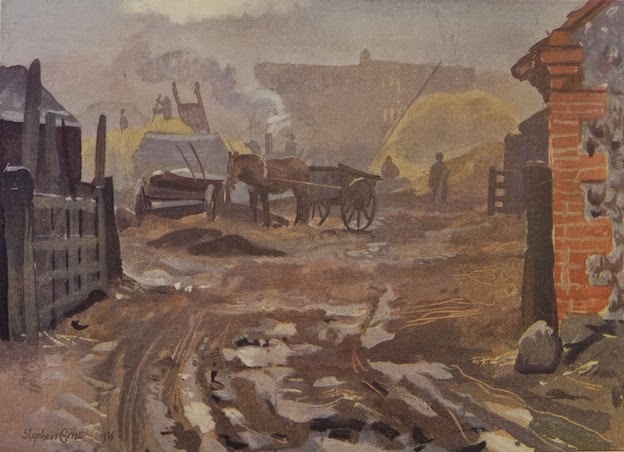
Winter Morning in the Farmyard…Illustration of the month

This month’s illustration is a farmyard scene by Stephen Bone, painted in 1936. Although it doesn’t have much architectural content (apart from the corner of a building on the right, which looks as if it’s built of flint with brick quoins) I greatly admire the way it conjures up a place and a time.

Stephen Bone (1904–58) was the son of the Scottish artist Muirhead Bone and his wife Gertrude Helena Dodd. He was encouraged to draw by his father and taught as a boy by Stanley Spencer, who lodged for a while at the Bone family house near Petersfield. Bone went to the Slade, but left early, not liking the school’s academic approach to draftsmanship, and embarked on a career as a book illustrator, excelling as a wood engraver. He also travelled widely, notably with his wife and fellow artist Mary Adshead (they met at the Slade), and when he travelled, he painted, producing colourful landscapes on board. Some of these travels led to a book, Albion: An Artist’s Britain, from which my illustration is taken.

What a lot of atmosphere Bone conveys with his limited and rather muddy palette. It’s winter, and quite early in the morning. The farm is already hard at work – the threshing machine is steaming away, someone is on top of a stack, a horse waits patiently between the shafts. We observe all this through the gate, at one remove, as it were – and through the mist, which makes the scene less distinct but also encourages us to look into the picture and puzzle at what’s going on. Bone reported: ‘Dimly through the mist one sees threshing in progress. The January frost was thawing into mud and my feet were cold and wet.’

From Bone’s thick, painterly way with the mud and frost in the foreground to the looming shapes of stacks and buildings in the distance, from the vague figures to the precise lines with which objects such as ladders and cartwheels are delineated, it’s clearly a composition that has been put together with great care. At first glance it all seems to so casual – those thick foreground daubs of paint. But look for a minute or two. Look at the gate, for example, and the artful way a few strokes of the brush summon up the shadows on the uprights, the frost on the top rail. Look too at the combination of diagonals (ladders, cart shafts, the stack-man’s fork handle), again portrayed with a few slender lines. Marvellous.

Bone’s Albion was published in 1939, the year war came. Its author-illustrator joined up, serving in the camouflage unit before becoming an official war artist (his father had been the very first official war artist in World War I). After the war he continued painting his landscapes, but dealers found them uncommercial. Bone carried on painting the way he wanted to anyway – but forged for himself additional careers in illustrated books (working with Mary Adshead), as a broadcaster (on popular British radios shows such as The Brains Trust), and as an art critic. I think he’s probably still rather under-appreciated: my copy of Albion cost just £5.

Wednesday, February 18, 2015

Taunton, Somerset


Tangled up in film

Some people who know Taunton much better than I were surprised when I expressed admiration for the former cinema, originally the Gaumont Palace, a building of 1931–2 by W. T. Benslyn now given over to bingo. It’s a rather large mass of a building, in the solid Art Deco mode of many cinemas. Benslyn was something of a specialist in this kind of building and had been assistant to Robert Atkinson, designer of truly remarkable Art Deco foyer in the former Daily Express building in London’s Fleet Street, so he was absorbed in both Deco and decoration.

What attracted me in Taunton was precisely a bit of decoration: this sculpture, apparently called Love and Life Entangled in Film. Life, naked and female, raises an arm towards Love, a winged Cupid. The visual structure of the piece is provided by the figures – the curves made by Life’s body and both characters’ limbs. The counterpoint to this are the curling loops of celluloid and the flowing waves of Life’s hair. The combination produces a beautifully poised composition, although it needs some strong sunlight to make the relief stand out against the rather dull brick of the rest of the building and to help us pick out the details. Although parts of the carving (Love’s face, for example) are rather worn, the piece is still worth a good look.

I was pleased to see that the relief is signed. The name of the artist, Newbury Abbot Trent, specialist in the contrasting arts of cinema and war memorial sculpture, is one I’ve noticed on cinemas before. The theme of a female body entwined with film seems to have been a favourite. No doubt cinema proprietors thought such sirens would be effective advertising, a good image of the allure of film in the years between the world wars. Looking back now, they certainly seem to sum up the glamour of the cinema in those times. I’ve noticed three such sculptures recently – one in Oxford, this one in Taunton, and one in Cheltenham. The first is still a cinema, the second a bingo hall, and the third has been demolished. Where they survive, then, Trent’s reliefs are a valuable link with their age.

- - -

Please remember to click on the image to enlarge it.

Saturday, February 14, 2015

Hertford


Red, orange, Strawberry

I pass by lots of Georgian houses and often give them an admiring glance – their proportions, Classical details, and brickwork are usually very satisfying. Cecil House in Hertford, a building of the 1770s, would probably have provoked a similar standard reaction: I like very much the red brick walls (Flemish bond) and the orange brick window surrounds, standing out from the crowd, but not too much.

But one feature stands out slightly more. It’s the porch, in the delicate 18th-century Gothic style (often called Gothick) that had become popular since Horace Walpole had begun to rebuild his house, Strawberry Hill at Twickenham, in the middle of the century. Slender clustered columns with little octagonal bases and minimal capitals support an upper area featuring a row of quatrefoils above repeated cusped blind arches. There’s a Gothic fanlight above the door and Gothic panelling in the reveals on either side of the door too.

None of this is anything like medieval Gothic, but it uses medieval Gothic motifs – quatrefoils, arches, little annulet rings around the columns, and so on – in a charming way. These motifs are combined in such a manner that they also recall classicism – those quatrefoil-decorated areas above the columns are a bit like a classical entablature, so that we are close to a sort of made-up ‘Gothic order’, something advocated by the 18th-century writer Batty Langley and a phenomenon I’ve noticed on other buildings of this period. The elements are rather plonked together in places, but that's part of their charm – as is the porch’s pointed, tent-like roof, which adds the finishing touch.

If the brickwork of this house seems to suggest tradition, solidity, and propriety, the porch is almost the opposite: improper, whimsical, and slightly flimsy. In many ways these two aspects of the building seem oddly matched, yet they are also true, in their different fashions, to their time.

Tuesday, February 10, 2015

Saffron Walden, Essex


The antidote to beige

Hanging around in Saffron Walden a few months ago, waiting for the Fry Gallery to open and some friends to turn up, I admired the nearby cottages, with their coloured walls. Where I live in the Cotswolds, nearly everything is made from limestone – “gorgeous, honey-coloured limestone” as the tourist brochures, never shy of a cliché, like to put it. Well, Cotswold stone is handsome stuff, and it has a colour palette that extends well beyond the brochure’s honey, embracing a variety of subtly varying shades from pale silvery grey to a sort of toffee brown. But sometimes, especially when not softened by flowers or greenery it can feel a little, well, beige. So I can find something to admire in a bit of colour wash on the walls of town houses, and have posted in the past about my love of pastel shades in places from Warwickshire to Lyme Regis. Coloured walls go back a long way, though centuries ago the results were more likely to be plaster tinted in yellows, ochres, or blood reds than these shades from the paint box. But, old-style shades or new, hats off to the people of the colourfully named Saffron Walden for putting some colour on their houses too.

Friday, February 6, 2015

Milcombe, Oxfordshire


A different angle

There is something satisfying about buildings that break away from the convention that determines that most of our houses and places of work are rectangular structures with rectangular rooms. Rectangles have their advantages, of course, They’re practical, accommodate our furnishings, and fit together well. But how about a round building occasionally, or an octagon, if not for human use, then for the featured tribe? There are quite a few circular dovecotes around, for the good reasons that they look good and work well. Inside, the walls are lined with nest holes, and in the centre of the interior is a vertical pole supporting a framework and a ladder. This contraption, sometimes called a potence, rotates, allowing the dovecote’s owner access to all the nest holes, so that the young pigeons (known as squabs) may be removed, and consumed. Octagonal dovecotes also have potences, although presumably the ladder can’t be so consistently close to the walls as with a circular design. Close enough, though, to allow one to lean out a bit, reach in, and do what one has to do.

This lovely example in local ironstone, with dormers in the roof and a crowning lantern through which the doves could come and go, adorns a green in the Oxfordshire village of Milcombe. The birds have long flown, but the little building is still an ornament to the village. It probably dates to the early-18th century and would originally have belonged to a farm or manor. The neat hipped dormers and lantern, together with the building’s unusual octagonal form, ensure that it’s still a visual asset to the locality, even though no longer used in the way its builders intended, and an object lesson in the pleasures that can come from buildings that avoid the ubiquitous right-angle.

Monday, February 2, 2015

Brailes, Warwickshire


Decorated

Now and then as I travel around the country I enter a church and I’m blown away not by the architecture, or the antiquity of the building, but by a single stand-out object – a bit of carving, say, or a stained-glass window – that makes my journey worthwhile. Things like this, as John Betjeman put it, hinting that you have to suffer for your art, are worth ‘cycling twelve miles against the wind to see’. Indeed – although I must admit I arrived in more comfort, on four wheels.

The church of St George in Brailes is a large building, mostly 14th-century but with a tall 15th-century tower. Inside, in spite of an interesting monument or two and at least one item that could qualify for one of my ‘odd things in churches’ posts, what got my attention was the font. Whoever carved this, some time in the 14th century, decided to use each of its eight sides as a showcase for a window design. These windows in stone are stunners, and present a round-up of 14th-century tracery in the style the Victorian antiquarians labelled ‘Decorated’, an appropriate term that’s still widely used.

So, in my first photograph, the carver illustrated on the left ‘reticulated’ (net-like) tracery, in the centre an interesting design with a pair of flame-like openings, and on the right a window incorporating the double-curved ogee arch that was so popular in this period. In my second photograph are three more designs: on the left trefoils, in the centre a wonderful whirling wheel, and on the right quatrefoils within a framework of intersecting tracery. Beneath the window designs are two bands studded with stylized flowers – four-petalled flowers and the round, incurved ballflowers, another very popular 14th-century motif that I’ve noticed before.


This kind of font (the one at Brailes is not unique, although such fonts are not common) is sometimes known as a pattern-book font, a term that suggests a mason providing a catalogue similar to those offered in printed books in the 18th century enabling builders and carpenters to run up the required kinds of fireplaces, doors, cornices, and so on. Not that a static piece of church furnishing from the Middle Ages could have quite the same purpose as a commercially available book – it’s a font, at the end of the day. But what a wonderful place to begin one’s journey through life. Or to end a 12-mile cycle ride.

- - -
Font-fanciers might like to know that I posted about a similar font, adorned with carved tracery but in the style prevalent a century or so later, in the church at Preston Capes, Northamptonshire.